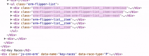
Created a system of embeddable election modules with component-level
breakpoints. Used across CNN homepage and articles from Primary through
General Elections 2016
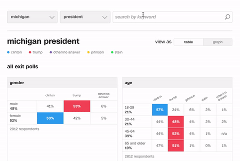
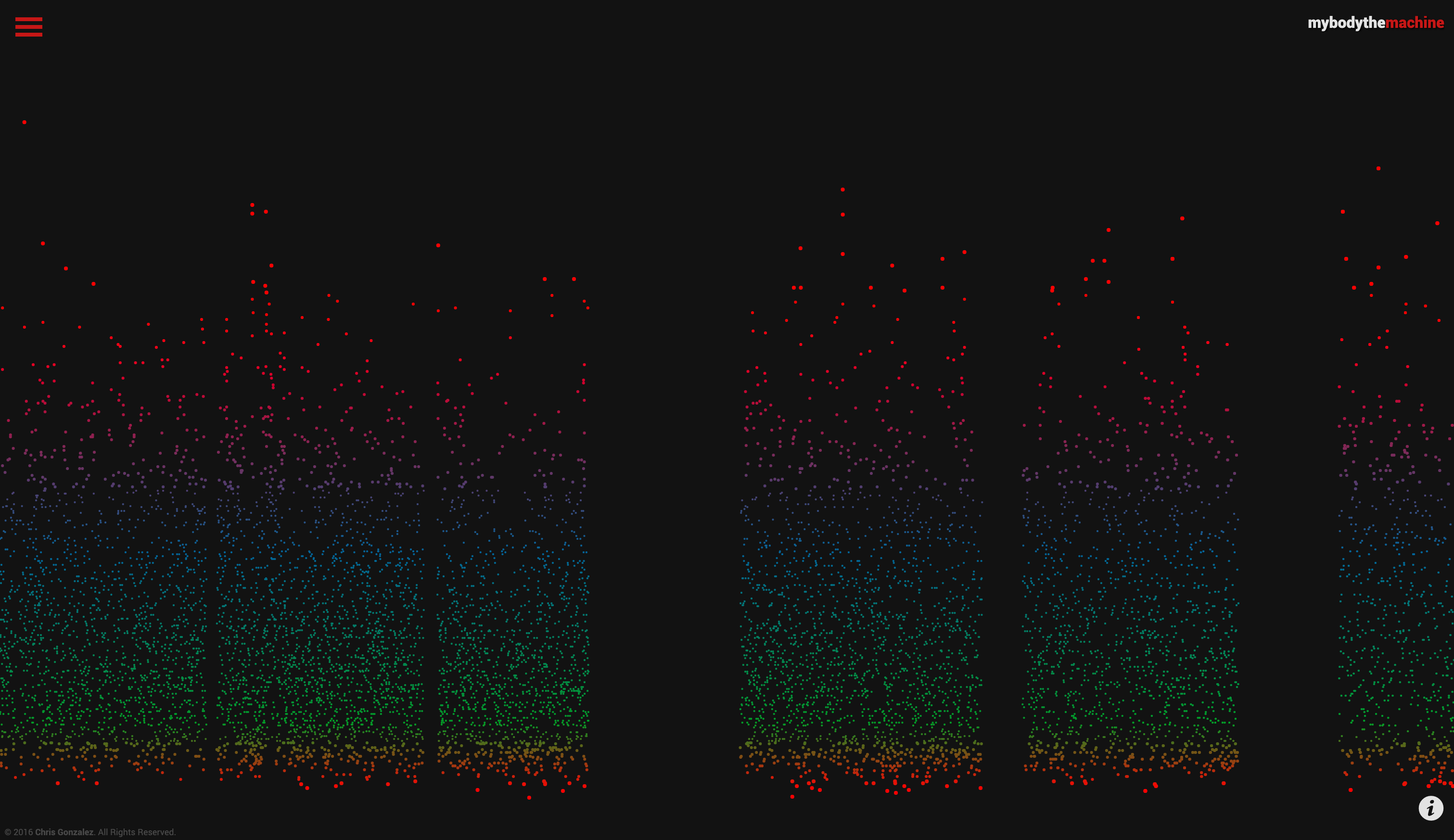
Designed and implemented all exit poll visualizations for the 2016 elections.
Graphics were used in TV shows and at protests!
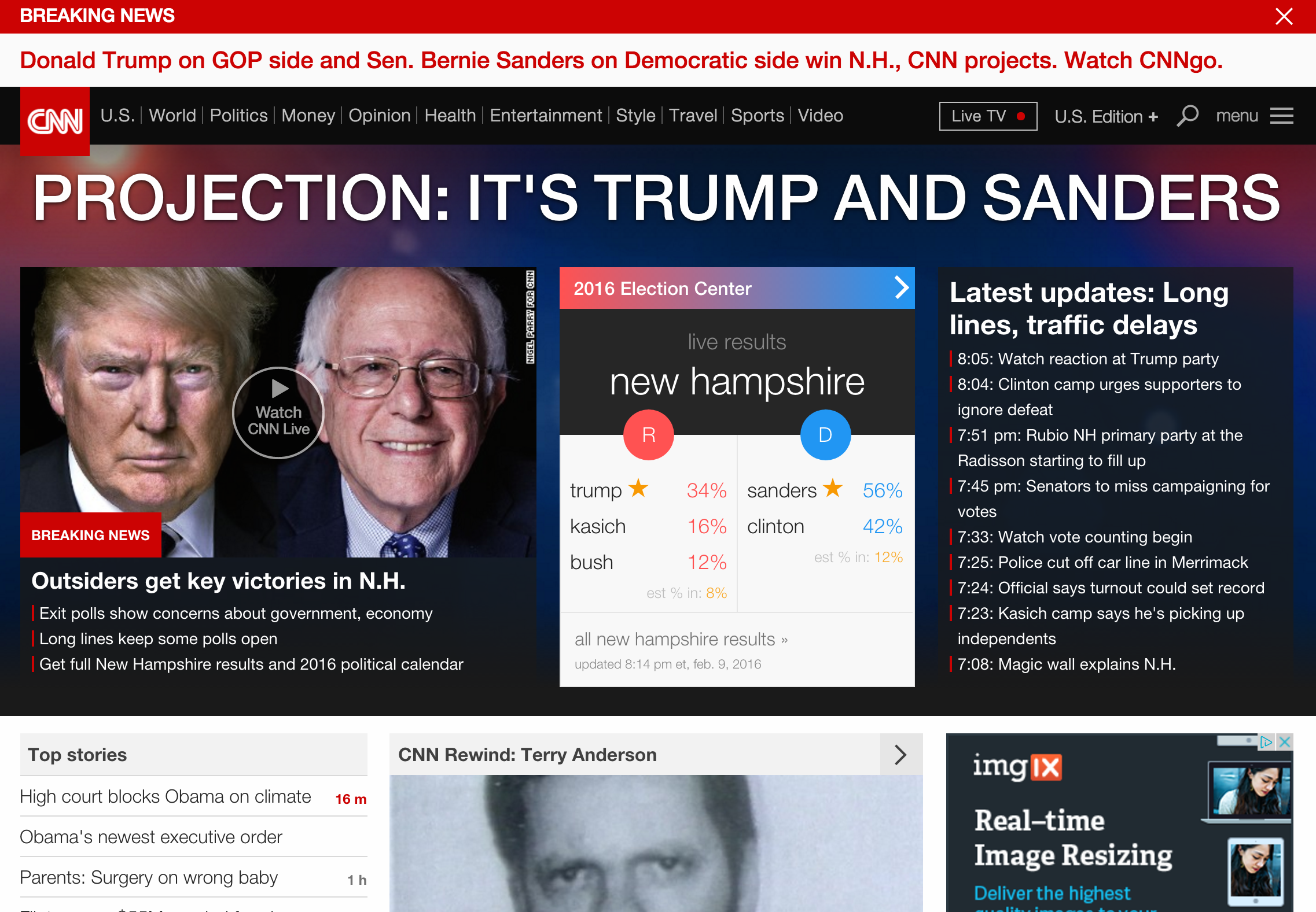
Prototyped and implemented an animated multiple-results module, used on
the CNN.com homepage on election night.
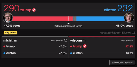
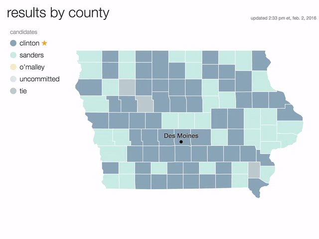
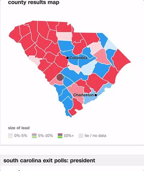
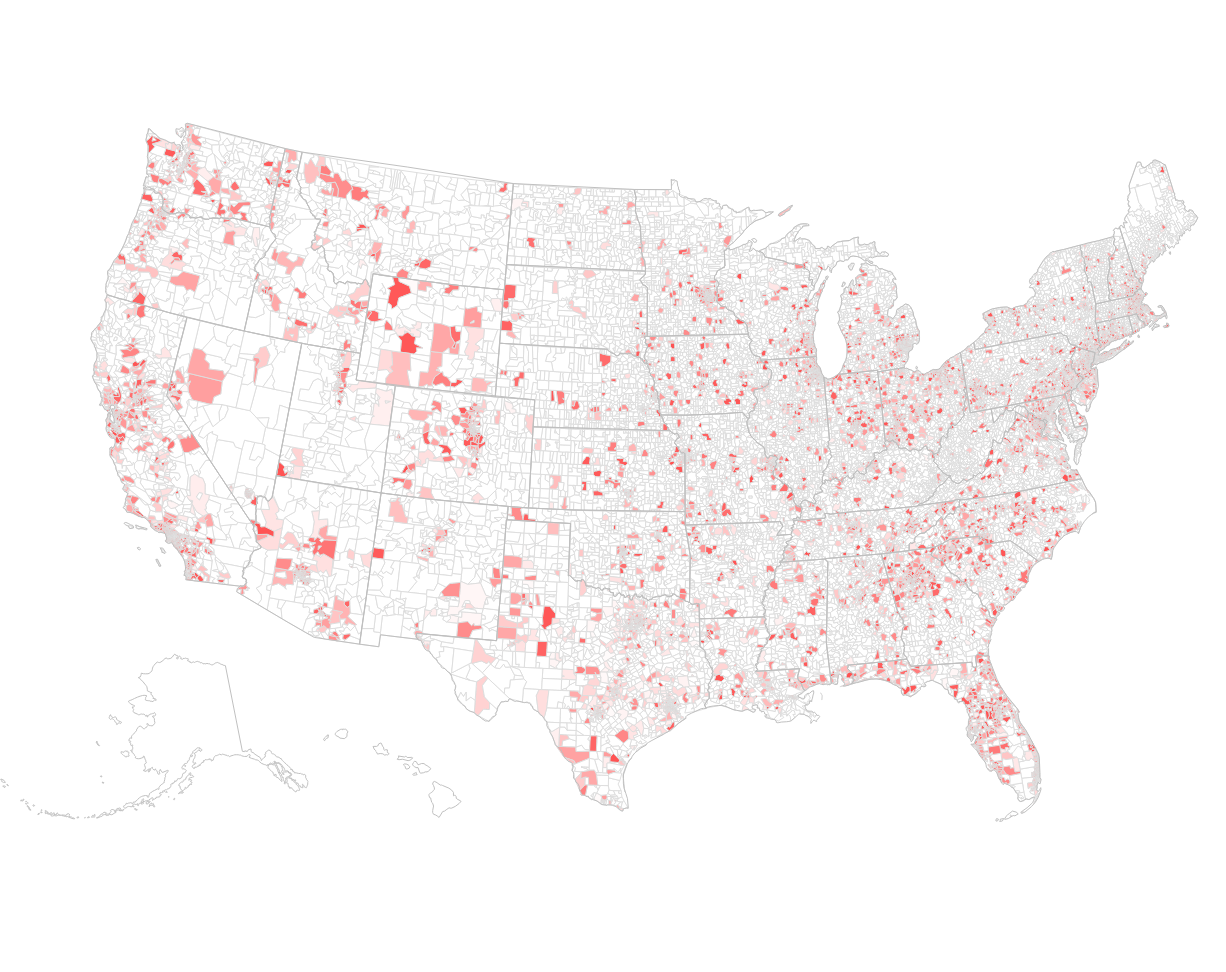
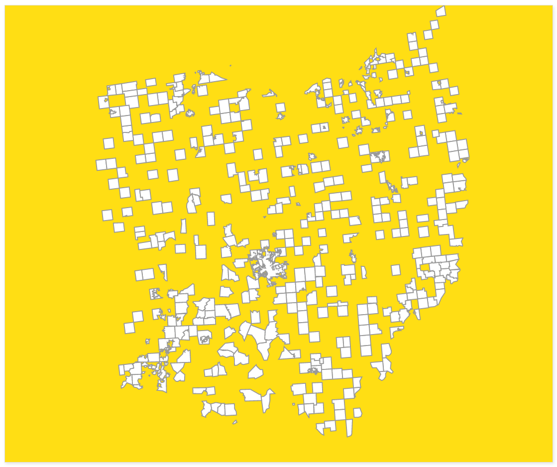
Prototyped and developed all geo map components for the 2016 elections
across mobile and desktop. Designed the shading scale to show "strength of lead"
at the county/parish level. Desktop shown above.
Mobile maps leverage different interaction affordances.
CNN front-end team circa 2014: Rebuilt the site navigation, the card model,
and refactored many thousands of lines of SCSS to launch a new CNN.com.
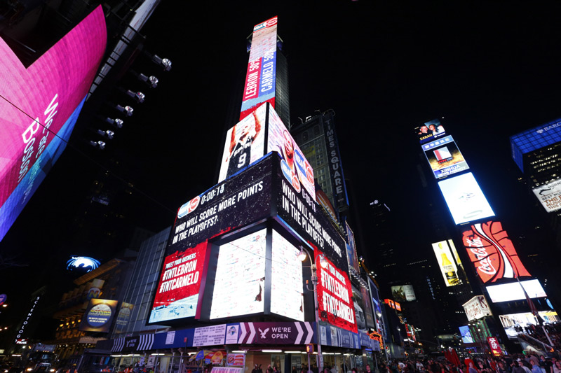
That time I made a Twitter-powered billboard visualization for the NBA in Times Square.
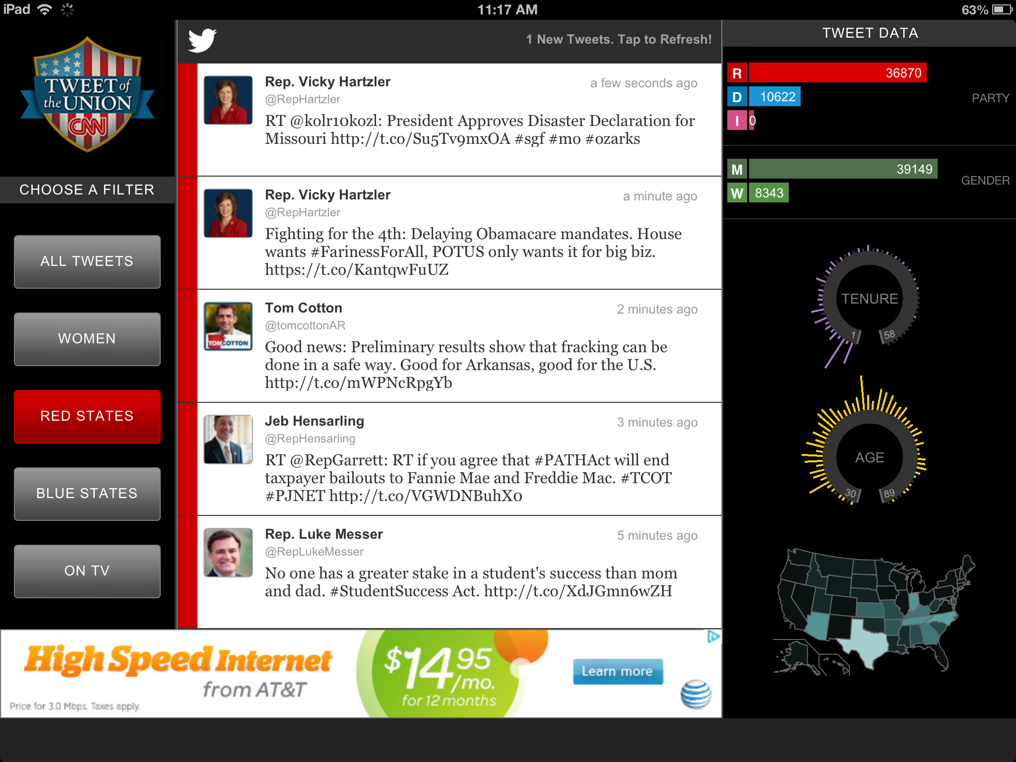
I coined the phrase "Tweet of the Union" and built an interactive for the CNN iPad app in 2012.
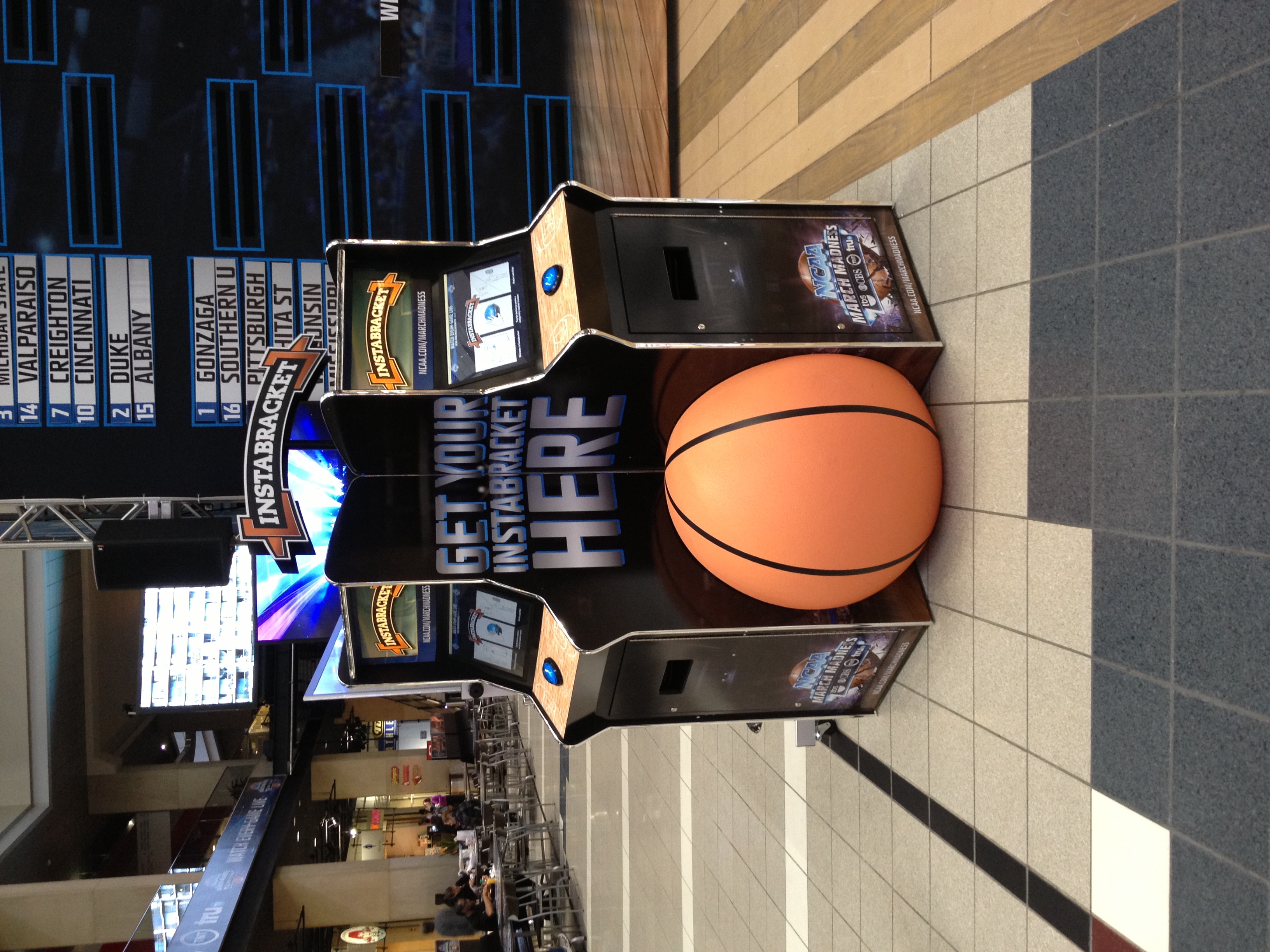
For some reason, kiosks were really big in the 2010s. This one generated an NCAA bracket for
you and printed it. Kiosks distributed around the US for March Madness.
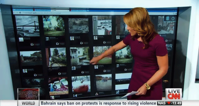
Putting Instgram on-air for CNN circa 2012-2013. Featured above: Brook Baldwin and a web app of tornado
images.